
Tomorrow's Impact On Today's Hues
Color Inspires Everything
Color Trends are your portal into the exploration of color. These trends are inspired by the newest influences and movements expressed in fashion, food, interior products, lifestyles and more.
Download Architectural Color Trends
At Sherwin-Williams Coil Coatings, we constantly monitor demographic shifts, changing social values, advancements in science, computers and technology and economic swings. All have tremendous impact on us. From Baby Boomers to Millennials, the way we live — as individuals, couples and families — is changing.
One thing is constant: color trends mirror the times. That’s why we define color with today’s lifestyle in mind, helping architects and designers capture every generation on canvases comprised of office buildings and pavilions, opera houses and museums. Only Sherwin-Williams architectural metal coatings match the creativity, imagination, passion and work ethic you put into your projects.
As the dynamics of our lives change, so do the colors we surround ourselves with and the ways we interact with the buildings we inhabit. Here we’ve taken today’s lifestyle trends and translated them into four color palettes that set the tone for tomorrow and for generations to come.
Video modal - Architectural Color Trends
Architectural Color Trends
With every building you create, exceed expectations for generations to come with Sherwin-Williams color palettes.
-
Color Obsessed
Every color has its story. At Sherwin-Williams, we help you tell that story.
Watch Video
FUTURE LUX
Luxury For One and All
Luxury isn’t about status anymore, nor is it exclusive. Tomorrow’s luxury is accessible and defined by utility. This also applies to durable goods, where functionality and flexibility combine with design and color to create objects as beautiful as they are useful.
The luxury goods of tomorrow enhance our experience of the world today. Luxury is coaxed from the raw elements, everyday materials that are processed in new ways and given luxurious finishes. Precious metals are reinvented for superior performance and strength. This is Future Lux. Elegant, minimalist and fully relevant to our lives.
Future Lux colors are honest, grounding shades derived from earth minerals. Hues like Rustic Orange and Satin lend a feeling of permanence and trust. When combined with shimmery metal, the look is unmistakably luxurious.
ALWAYS ON
Digital is the New Frontier
If you haven’t heard of the internet of things, you will. From smartphones to smart homes, 3-D printing to augmented reality, there’s no turning back from the digital age. Some may struggle to keep up with technology, but those who were born into it — the digital natives — couldn’t imagine living any other way.
At no time in history has technology moved so fast, but for these digital natives, known to many as Millennials, learning a new interface or social platform is just life as usual. Their computers and smart phones are extensions of their bodies and minds. Much like millennials themselves, the color implications of Always On are shifting, multidimensional hues that are hard to define and yet easy to see their powerful effect.
Taking cues from the devices we’ve grown to depend on, colors like Gentle Violet and Honeymoon Bungalow are daring and experimental, mimicking the transitional nature of the digital world.
LIFE IN FLEX
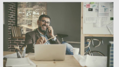
Blurring the Lines Between Work and Play
Thanks to new technology, it’s never been easier to go untethered. As a result, younger generations don’t compartmentalize their lives the way previous generations did. Work is no longer 9 to 5. Play is no longer reserved for weekends.
This new, more flexible lifestyle is accompanied by a change in the way we think about color in a professional setting. The comforts of home — be it a casual-styled couch or colors typically reserved for home interiors — are migrating into the workplace. Color feeds creativity, and the colors of home are bringing new life and inspiration to our Life in Flex.
Life in Flex colors are bold, expressive hues that make individual statements but still stand together. Spiced Pumpkin and Pavestone are colors that help us feel comfortable at work by making us feel at home, while reshaping our traditional understanding of space and function.
HIT PAUSE
Actively Slowing Down
Never before has opportunity been so accessible, or the comforts and conveniences (and distractions) of a modern lifestyle more affordable. Thanks to technology, our every whim is “on demand.” But so are we. We're doing too much, moving too fast, outpacing our natural rhythm, and people are looking increasingly inward for reprieve.
So add this to your vocabulary: digital downtime. The potential for an unparalleled quality of life is there, but only if we use technology to our advantage, instead of being a slave to it. Hit Pause is the color palette that puts us in the frame of mind to slow down and reset. Not just disconnect, but realign body, mind and soul.
Hit Pause consists of rich tones and healing colors that help us stay centered and resist the urge to do it all. Colors like Aqua Mint and Rocco Beige remind us to turn off, and turn within. These shades help us recharge by ushering in new, positive energy.
