More Than Just a Passing Trend
The Intense Color Journey: More Than Just a Passing Trend
August 2016
Previously published in Coatings World - Read Here
The importance of color is lost on no one. It is one of the biggest factors that shapes our lives and view of the world. Color conveys emotion and defines cultures; it inspires us and provokes reaction. Though the end goal has always been to produce an exceptional coating that conveys a point of view on whatever structure it is applied to, the trends that architects use in order to tell that point of view have changed. Color requests are getting more varied, and texture and prints have become extremely popular in the last few years as they increase the aesthetics that a panel and coating alone can provide.
Every color trend starts as a small idea in someone’s mind. Whether an architect dreams of a vibrant red never before used on a building, or a coating manufacturer sees the possibility of a true blue pigment in a lab test tube, dozens of dimension-defying colors are created every day. These colors are talked about behind the scenes, introduced in cutting-edge projects and then asked for by the masses. But at the beginning, coating formulations are just as important as the idea itself, and years of research are put in before a product is ever brought to life and considered a trend.
Coating Creation and Formula Make-Up
In the paint and coating industry, we know that it takes more than mixing a few pigments and resins together to create a beautiful, long-lasting color. During the development process of a coating, art and science are carefully combined to produce the desired end product: a vibrant finish that is durable, sustainable and imaginative.
When designing boundary-pushing products, innovative methods are explored and new materials tested to see what achievements can be made that will ultimately advance the industry as a whole. One of the more interesting and popular developments in coatings over the years is a pearlescent finish that can add shine, shimmer and even change colors.
Research and development teams put much thought and testing into creating this illustrious type of coating, testing different formulations to achieve exactly what they were looking for. Pearlescent pigments contain mica flakes that are coated with different oxides, including titanium dioxide, tin oxide or iron oxide. When light hits the oxide-coated mica particles, it is partially reflected out and partially absorbed in. As the light travels into the particles and the various layers of oxide surrounding them, a sense of visual depth is created which adds dimension and distinction to the finish and product featuring the coating.
Essentially, the color that is produced depends on the oxide coating, which varies in thickness related to the chemical process used to coat the mica particles. Consequently, coating colors and the amount of shimmer vary by changing the thickness of the oxide. For example, on the same structure you might see a silver appearance at one thickness level, and on another you will see yellow or blue.
The same scientific and chemical process applies for color-shifting pigments, as well — the color-change depends on both the chemical formulation of the base coat pigment and the oxide-coated mica particles. The formulations are so advanced that they can affect how transmitted light at a particular angle will be seen and “assign” different colors to different light angles. The color-shifting mica pigments are suspended in a fairly transparent clear coat that is then layered on top of a base coat. Consequently, you can take the same color-shifting pigment, the micas in the clear coat, and layer it over a black or white base coat to see completely different colors and intensities in coatings.
Now, there are ways to expand these pearlescent finishes beyond the average colors of white, silver and beige to create a spectrum of colors, including reds and oranges. Historically, there have been issues with these particular colored coatings because they contained undesirable materials, like lead and cadmium. While responsible coating manufacturers stopped using these chemicals in their formulations, eliminating these materials also changed the make-up of the finishes and restricted the creation of these coatings, which happen to be some of the most sought after colors from architects.
Over many years, research has been conducted and products have been tested time and again to create these specific color coatings in a responsible way that still hold their vivid hues for many years. Thankfully, some coating manufacturers have found a way to produce rich colors that add dimension and last for more than 20 years, keeping in mind the fact that the durability of the color is just as important as the initial bold color impact. Fluropon® Rustica is one of these product lines that features super intense pigments that stand up to extreme weather elements. Fluropon Nova is another that contains the pearlescent finish that so many architects want for their most prominent projects. By using newly created specialty pigments, the industry as a whole is moving into color spaces that haven’t been reached previously.
Coating manufacturers want to provide more offerings and styles to architects while keeping the durability and quality of the product in mind. They also want to encourage a broader conversation around color and discuss what is trending and why. It can be hard to imagine all of the color possibilities that are attainable without actually seeing them, so let’s explore some of today’s trendiest projects that feature bold colors and innovative formulations.
Related Articles


Trending Colors
Pearlescent Pigments:
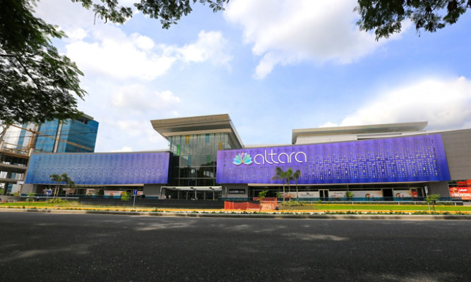
- The metal panels of the Altara Center in Honduras feature a sparkling, color-shifting effect as the light reflects differently off of each mica particle in the coating. The custom blue/purple finish shifts colors throughout the day as the sun changes position and adds dimension to the end product
- Prismatic colors project a startling visual depth on the Wolf Creek Library in Atlanta that suggests the building changes colors when viewed from different vantage points. A shimmering copper-red hue blends impressively with the building’s subtle architectural materials of glass, stacked stone and fiber cement panel walls that are finished in a natural bronze tone.
Color Shifting Shades:
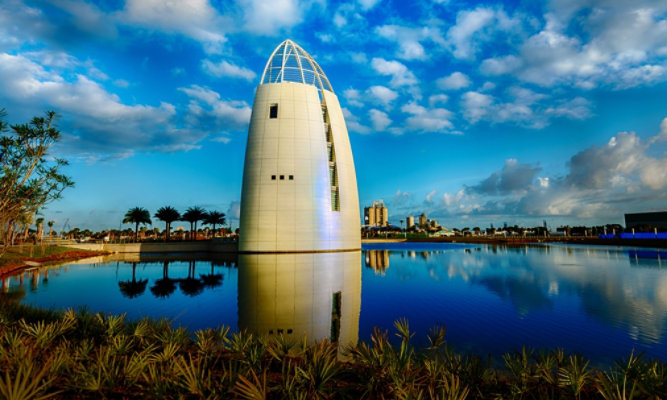
- These inventive coatings offer a mesmerizing, bilateral color finish. Thanks to recent advances in the technology and chemistry behind a coating’s makeup, multi-color finishes give the appearance of a color spectrum when viewed from different angles or with varying amounts of sunlight. Kamer Eser’s California home and the Exploration Tower at Port Canaveral both showcase this color-shifting coating that adds depth from every single angle.
- For some projects, a little can go a long way. The architects of the Humane Society Silicon Valley kept this in mind and mixed natural colored coatings, like copper and brown, with color shifting finishes to offer bold color consistency mixed with a fluid finish feature.


Intense Tints:
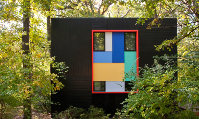
- Some people will always want to stand out from the crowd, and Alan Kanner falls into this group. His home in Takoma Park features a jet-black coating on metal panels with pops of playful hues. The black metal, a defining component of the exterior aesthetic, was also selected to function as a backdrop for a palette of accent colors and reflect the paintings in artist Richard Diebenkorn’s Ocean Park Series.
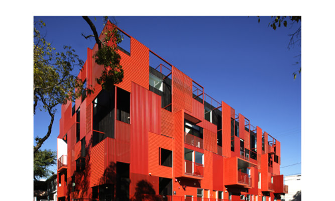
- The Formosa 1140 Building in West Hollywood features a striking red metal exterior that brightens its neutral surroundings and corresponds perfectly with the housing unit’s contemporary design.
- Certain projects feature multiple colors simultaneously, playing off of one another in glorious harmony. The Mosaic Village, part of Johnson C. Smith University in Charlotte, NC, does just this by mixing blue, gray and green coatings on the new building. The colors aid the dynamic design of the dormitory and tell the story of the location’s connection to jazz music.
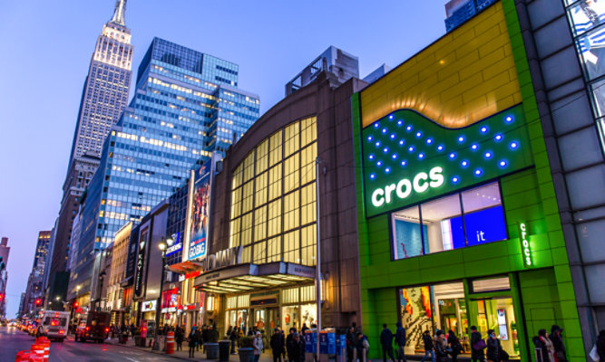
- A well-known brand like Crocs™ needs to keep up appearances, not only in regards to their products, but in their brick-and-mortar locations, as well. When the company began developing their flagship store in New York City they knew they wanted to keep their brand aesthetic first and foremost in all aspects of the design. They decided to showcase their trademarked bright colors on the storefront to ensure a lasting impression was left on everyone who walked into, or passed by, the store.
- Sometimes, you just can’t decide on a single inspiration. Architects of Bells Mill Elementary School used a variety of inspirations, including brick and metal materials, historic and modern influences, colonial and farmhouse designs and four different colors to create this unique community of buildings.


The Natural Route:
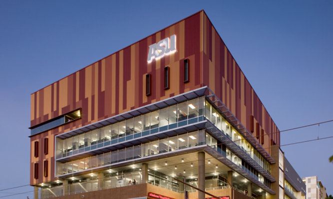
- A popular design element is to highlight the natural surroundings of a building as opposed to fighting with them for attention. The Walter Cronkite School of Journalism & Mass Communication at Arizona State University took this approach to heart and created a building that features varying shades of copper to match the gorgeous desert landscape on which it resides.
- Similarly, architects of the JW Marriott in Austin used coatings that matched the natural resources found in the local Texas environment. The materials used mimic the appearance of weathered steel, and the coating colors match that of the nearby rocky terrain.
- On the other hand, some buildings, like Judson University, don’t have the luxury of being placed among lush greenery or dazzling deserts. In this case, architects used natural copper colors as coatings for the expanding Benjamin P. Browne Library and architecture program to represent natural elements that aren’t found on the building site.
Color is ever evolving, as are we, and our preferences and attraction to certain colors will change as we do. As we see more of what the world has to offer, our exploration into the realm of color will become deeper and richer. Ultimately, it’s up to us to define the trends and keep pushing the boundaries – let’s rise to the challenge.
By: Jeff Alexander, VP of Sales, Sherwin-Williams Coil Coatings
News & Media
Featured Media
Stay up-to-date with the latest product releases, news and upcoming industry events.
Go to Resource Center