SHIFT branding

Sherwin-Williams® Colormix® Foresight

Presenting SHIFT, a future-looking color trend forecast featuring 18 inspirational hues primed to make an impact.

All around us, SHIFTS are happening. The Color, Material, Finish (CMF) experts at Sherwin-Williams embrace this fluidity and provide definitive clarity through the Colormix® Foresight program. SHIFT kicks off this forecast cycle, conceptualized by the visionary team at the Sherwin-Williams DesignHouse and backed by expertise in the Industrial and Architectural markets. 

Download the SHIFT: Colormix® Foresight Brochure

Fill out this brief form to access your copy.

Introducing SHIFT

A trend forecast of 18 colors positioned to accelerate in the metal coatings market and emerge, evolve or peak over the next three to five years.

At Sherwin-Williams, we harness the power of color and believe in its ability to inspire, connect and bring ideas to life in tandem with trusted coating solutions. The DesignHouse color experts utilize data-driven color analyses to formulate the SHIFT color trend report for metal coatings.

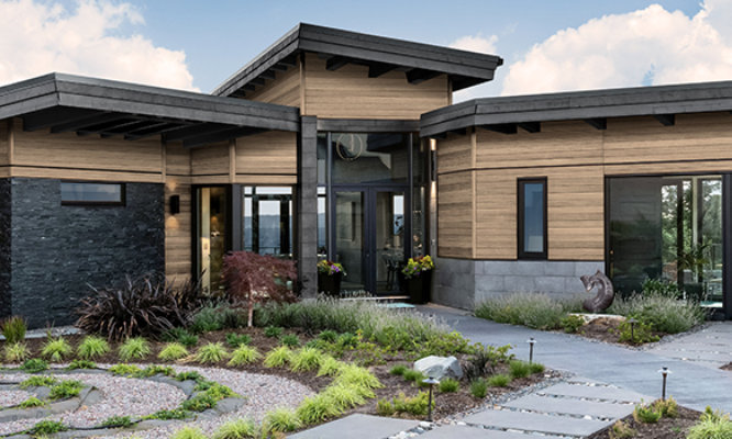
In Coil and Extrusion markets, where products often have lifespans of decades, selecting the right color can influence everything from architectural appeal to consumer confidence. The SHIFT color forecast helps product designers, manufacturers and architects prepare for the future and arms them with a competitive edge.
 

SHIFT Color Brochure


SHIFT in Motion

Building and Manufactured Products Metal Forecast

The color choices we make are shaped by more than just pop culture, media and entertainment. Key mega and macro drivers reflect shifting trends both locally and on a global scale, ultimately influencing decision-making, resource allocation and the direction of meaningful change.

Through industry expertise, data-driven research and strategic analysis, Sherwin-Williams color experts translate the effect of those forces on color trends
 

test

SHIFT Colors

18 Colors Primed to Make an Impact

The Sherwin-Williams DesignHouse color experts identified 18 key colors primed to inspire and accelerate in the Coil and Extrusion market over the next five years. Colormix Foresight helps ensure that the color choices made today will continue to feel intentional, relevant and meaningful far into the future. These 18 colors are organized into four groups: Light Neutrals, Warm Chromatic, Cool Chromatic and Dark Neutrals.

Fractal Color Swatch

Building with Fractal color

Fractal

Fractal evokes calm complexity and the forward momentum of scientific breakthroughs, from weather innovations to space travel. The soft, off-white hue warmed by a hint of gray is a serene, neutral base that feels both clean and quietly luxurious. The satin finish enhances the delicate appearance of papier-mâché or the lunar surface. Fractal speaks to the future of refined minimalism, where design and discovery coexist.

E-391C1886 C-431B3249


Minimalist Color Swatch

Minimalist Color Building

Minimalist

A sparkly silver with mica flakes, Minimalist shimmers like dancing stars. The gentle, satin shine elevates the hue to the breezy boundary between our atmosphere and outer space. Minimalist embodies outside-the-box thinking without losing its roots in systems and science — an ode to satellites, moonshots and the quiet logic of the cosmos.

E-399D9521 C-439Z11820M


Aqualogic Color Swatch
aqualogic color in laundry room

Aqualogic

A serene aqua, Aqualogic is perfectly balanced between blue and green. A pearlescent shimmer softens the hue, lending a silvery, satiny finish that evokes the fluid elegance of water in motion. Reminiscent of the ecosystems it honors, this blue-green color speaks to the value of water as a precious resource, trust in sustainable systems and finding inspiration in nature’s blueprint.

E-399D9520 C-439Z11819M


Facade Color Swatch
Facade color

Facade

Facade captures the essence of concrete — a warm gray with a hint of champagne. With both texture and mica, this neutral hue delivers visual depth and tactile realism, mimicking the layered complexity of urban infrastructure, Brutalist architecture and natural formations. Facade feels like a cross-section of civilization, where social dynamics, nature and design intersect. It offers the quiet strength of multifaceted communities and foundations built to last.

E-399D8421 C-439Z11824MTX


Precious Pyrite Color Swatch
Precious Pyrite Color on building

Precious Pyrite

Precious Pyrite is a champagne hue with an anodized texture that feels like a quantum relic from a digital future. It shimmers with mica and subtly shifts between warm silver and soft gold like empathy flickering through a blockchain. Precious Pyrite embodies the emotional currency of the metaverse, where value is traded not just in cryptocurrency but in uncertainty as well as compassion.

E-399D9511 C-439Z11817M


Activate Color Swatch

Building with Activate color

Activate

A sporty, just-dark-of-true-red hue, Activate radiates power and precision — like a signal flare ready to take action. The color commands attention and asserts dominance in any visual hierarchy, instilling confidence to cross any finish line in first place. The high-chroma red delivers passion in style, making it the ultimate call-to-action shade.

E-SL4A1831 C-434B3434P


Interstellar Color Swatch

Interstellar Color Building

Interstellar

A heavy sprinkle of mica helps the planets align, as Interstellar delivers a galactic shimmer that brings a sparkle to even the darkest corners of outer space. It’s an otherworldly member of the orange family — a mixed-metal copper with a satin shine that could as easily be found in the natural metals on Mars as it could be on Earth.

E-399D9509 C-439Z11816M


Fortified Color Swatch
Fortified color inspiration

Fortified

Fortified takes global inspiration from the ground up — a rusty-red terracotta color reminiscent of everything from desert sands to stripes of iron ore to the tiled roofs of the Mediterranean. Featuring a tactile texture, the deep, high-chroma red is earthy and universally familiar, harmonizing the built environment with nature. But awaiting just one glimmer of sunlight, the russet mica effect is eager to showcase its subtle sparkle.

E-399D8561 C-439Z11815MTX


Kindred Color Swatch
Kindred color on building

Kindred

Kindred is a toned-down hue that steps outside of the orange family and into a neutralized space of tans and browns. The nurturing influence of the mid-range brown is echoed in its suede feel and soft-touch finish. It is luxury without being showy, a foundational element of our relationship to the people and spaces around us.

E-397C1822 C-437C3977


Restore Color Swatch
Restore Color on building

Restore

Restore is a grounded oxblood that settles into the black-brown spectrum while quietly retaining its redviolet and red-blue undertones, like embers beneath aged wood. Its depth evokes the tactile richness of leather-bound books and archival ink. With a low-gloss finish that softens its intensity, Restore invites a sense of quiet resilience — a visual coziness steeped in history.

E-397C1821 C-437C3976TX


Snake Eyes Color Swatch

Building with Snake Eyes color

Snake Eyes

A hyper-digital yellow-green, Snake Eyes pulses with energy. The bright hue bridges the digital and physical worlds, enhanced by mica for a backlit intensity with a standard gloss. It’s a visual dopamine hit, a color shock that recalls the electric nostalgia of early gaming consoles and pixelated pop culture, now reimagined for next-gen UX/UI design. 

E-399D9519 C-439Z11818M


Bills Color Swatch

Bills Color Building

Bills

Bills is the color of currency in motion, a true green with a whisper of blue undertone. It’s globally minted and refined — like a cultivated lawn that thrives where intention flows. Infused with a silvery-aluminum metallic flake, Bills catches light with the right amount of bling. In a world of migration and markets, of tariffs and treaties, this is a Nova color that knows the cost of power and the price of prosperity

E-395FX0044 C-435FX3686


Rush Color Swatch
Rush color building

Rush

A high-chroma, electric blue, Rush pushes beyond true blue with a touch of red undertones. Rush ignites the senses — a visual stimulant for an active, high-velocity world of powersports and evolution in motion.

E-396B6980 C-436B4641


Builder Color Swatch
Build color on building

Build

Builder is a deep green with a pronounced blue undertone, evocative of the misty, gray-toned evergreens of the wilderness. Grounded in realism, Builder can function as one of nature’s neutrals — adaptable, trustworthy, resilient — embodying the ethos of “trust but verify” in building practices, energy use and material sourcing.

E-395C3027 C-435C3687


Equilibrium Color Swatch

Building with equilibrium color

Equilibrium

Equilibrium is a green-gray with a hint of yellow that captures the eerie stillness before a storm, when the air feels charged with possibility. Slightly darker in tone, this solid hue evokes tension and balance. Equilibrium provides grounding amid life’s uncertainties, serving as a guide for navigating where we stand and where we are going.

E-395C3029 C-435C3688


Perplexed Color Swatch

Perplexed Color Inspiration

Perplexed

Perplexed is a softened, grayed-out violet that feels both industrial and spiritual, with a mica finish that leans into the quiet shimmer of an anodized appearance. The midtone hue bridges the mystical and the material, offering a grounded take on self-reflection, community and shared space. Perplexed speaks to self-compassion, collective care, creativity in connection and the courage to ask life’s biggest questions.

E-399D9523 C-439Z11823M


Aura Color Swatch
Aura color building

Aura

Aura is a moody violet-gray that hovers near black. The faintest trace of red-violet in its undertone is balanced by semigloss, allowing a cool gleam to filter through. This is a color of emotional depth and digital duality, where virtual reality aesthetics meet raw human experience. Like a thunderhead on the horizon, Aura carries weight and wonder, offering comfort in the shadows.

E-399D9522 C-439Z11822M


Builder Color Swatch
Bronze door color on building

Bronze Door

A deep, warm bronze, Bronze Door is grounded in the richness of earth’s minerals and the legacy of craftsmanship. This complex neutral features a subtle, slightly warm mica, creating a refined, mineralized glow. Bronze Door speaks to the responsible use of our planet’s resources, honoring our heritage while advancing society through sustainable design.

E-399B745 C-439Z11825M


Tailored Finishes. Unmatched Impact.

Sherwin-Williams Coil Coatings offers an assortment of special effect pigments to add depth and tactility to color selections. Our metal coatings are available in a range of sheen and gloss levels, dazzling micas and metallics, Nova sparkle, color-shifting Kameleon, and meaningful textures. Unlock a spectrum of color and design options through revolutionary coating effects.
 

placeholder

SHIFT Color Trend Report: Why Forecasting Matters for Coil & Extrusion

Learn how Sherwin-Williams leverages research-driven color forecasting to help the Coil and Extrusion industries anticipate design shifts, find inspiration and gain a competitive edge in a rapidly evolving market.

Contact Us

How Can Sherwin-Williams Help?

Get in touch with your local Sherwin-Williams Representative to learn how Sherwin-Williams can be your competitive edge.

Contact Us

Back To Top