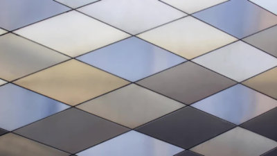
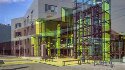
Architectural Metal Color Trends: Hit Pause
Duration - 1:9
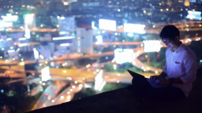
Technology is the great equalizer. Never before has opportunity been so accessible, or the comforts and conveniences (and distractions) of a modern lifestyle more affordable. Our every whim is on demand, if we choose. But so are we. Doing too much, going too fast, outpaces our natural rhythm. Increasingly, people are looking inward.
Here’s a new term: digital downtime. The potential for an unparalleled quality of life is there, but only if we use technology to our advantage, instead of being a slave to it. Hit Pause is the color palette that puts us in the frame of mind to slow down and reset. Not just disconnect, but realign body, mind and soul.
The color implications of Hit Pause are rich tones and healing colors that help us stay centered and resist the urge to do it all. Colors like Aqua Mint and Rocco Beige remind us to turn off, and turn within. These shades help us recharge by ushering in new, positive energy.
Related Videos
Color Inspiration Videos
Color trends mirror the times. They impact how we work, live, and play. At Sherwin-Williams Coil Coatings, we create color palettes with the same creativity, passion, and work ethic you put into your building.
Watch More Videos