Children's Hospital of Philadelphia
How Do Colors Affect Architecture?
Whether serving a functional purpose or creating a visual statement, architects use color strategically to make an impact.
Color is all around us. It can impact our mood, assist in wayfinding and influence our decisions. Color can also affect architecture, from serving a unique function to altering people’s perceptions. Architects use color to identify purpose, separate or enhance spaces, add decoration and evoke feelings.
Psychology plays a large role in how color affects architecture. Just like repainting a room sets the tone of your space, the intentional use of color can affect how it is received by its target community. For a commercial building, the use of vivid colors could signify that the destination is fun, exciting and bold. In residential construction, adopting lighter colors could make a building more attractive to customers who perceive those hues as clean, peaceful or refreshing.
Real-World Color Stories
The Pacific Corporate Towers campus in El Segundo, California, is a success story in the effects of color. The high-rise office park features three towers, which were originally white, nondescript and did not make an impact in their environment. To attract new tenants and appeal to creative and technology clients, the owners decided to make a statement — with color. By strategically placing bold blocks of blue to harmonize with the open sky and nearby Pacific Ocean, as well as making updates to the landscape and common spaces, the buildings made a fresh, modern statement. By creating this more inviting environment, the owners were able to better attract and retain additional tenants.
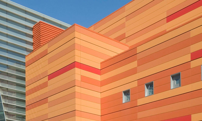
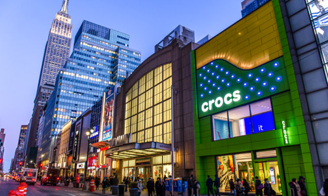
Multiple factors are considered when designing a building, including the structure’s purpose. Places like hospitals or health centers might seek to harmonize with nature, choosing organic colors or neutrals to create a sense of calm and balance with their surroundings. In the case of the Children’s Hospital of Philadelphia, architects chose to focus on a different sentiment: vibrancy. When the hospital opened the Buerger Center for Advanced Pediatric Care in 2015, the 12-story addition featured high-performance Sherwin-Williams Fluropon® coating systems, alternating each floor with different bold, primary colors. In addition to providing long-lasting performance and color retention, the architects chose the coatings for their ability to cultivate a welcoming, kid-friendly atmosphere.


Pacific Corporate Towers before renovation

Pacific Corporate Towers after renovation
Color Psychology and Function
Associations between colors and their connotations can provide a level of instant understanding. While yellow can identify equipment and areas that should be approached with caution, the bright color also symbolizes sunshine and cheerfulness. Seeing a red structure often evokes a rural essence, stemming from the visual of barns, which were traditionally painted red dating back to the early settlers in New England. Farmers added the red iron oxides of rust to their barn-coating mixtures as an inexpensive option with a functional purpose: the coating helped protect the structure from mosses and fungi, and the color absorbed more of the sun than leaving the wood bare.
Historically, light colors were the default in the agricultural sector for their energy efficiency and ease of cleaning. But new science in the capabilities and effects of modern coatings allows functional properties to be built right in. Examples include solar reflective pigment technology and innovations that better repel dirt — launching access to a whole spectrum of hues that meet aesthetic preferences without losing the function.
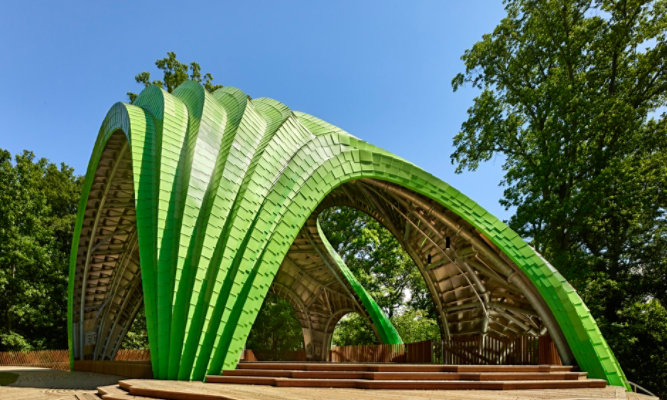
Functional colors also go beyond performance, durability and energy savings. Architects strategically employ color to identify areas of safety, highlight points of entry, improve wayfinding and promote brand recognition. Intentional applications of color could both complement the landscape where a building is nestled or playfully contrast with it. The Altgeld Gardens Family Resource Center in Chicago does just that, bringing a sense of vitality to an urban setting and welcoming visitors with its swooping, multidimensional facade featuring metal panels coated in bright blue Fluropon.
Ahead of the Trend
Color spaces are always shifting, as new colors emerge and trend cycles evolve. Agricultural, commercial, retail, residential and multifamily architecture are just the start to the industries that have a great impact when it comes to color. Though they might follow the same trends, the various markets cycle at different paces. Regional and cultural norms, new technologies and changing demographics also play a role in the perceptions of colors and their effect on architecture.
Industry leaders like Sherwin-Williams are continuously innovating and researching color trends, and then applying that expertise to explore how it affects architecture. This includes improved technologies and the use of science to achieve lasting durability and color retention. Research also examines shifting consumer trends, such as the emerging use of color as a neutral, from soft blues to dark greens.
With so many options, architects can turn to our Sherwin-Williams Coil Coatings team for access to the ever-expanding color catalog, inspirational palettes, and results from ongoing innovation, research and trend analysis.
We’re Here to Help
Whether you’re looking for color inspiration or ready to start a trend all your own, contact a Sherwin-Williams rep to turn your vision into a reality.
Skip carousel content
Related Color Trend Articles
Architectural Color Trends
Take a look at other color trend articles.
Go to Media Center