The Hit Pause Color Trend - Actively Slowing Down


Technology is the great equalizer. Never before has opportunity been so accessible. The comforts and conveniences — and distractions — of a modern lifestyle are more affordable than ever. Our every whim is on demand, if we choose. But so are we. Doing too much, going too fast, never unplugging, always responding, getting distracted, feeling overwhelmed. Our digital lives are outpacing our natural rhythm. Increasingly, people are looking inward.
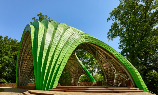
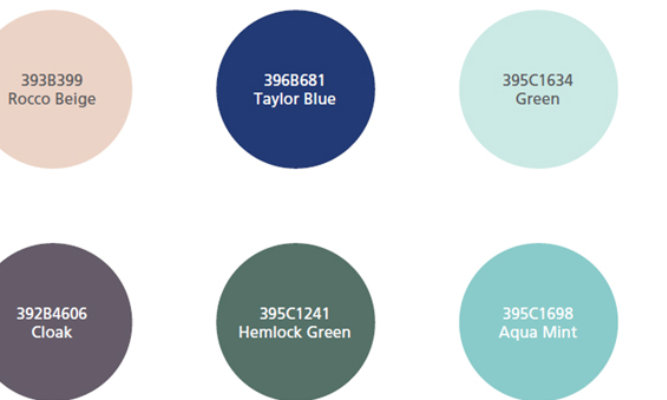
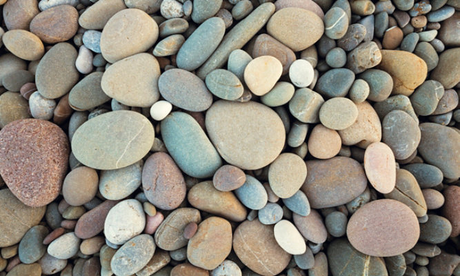
Here's a new term: digital downtime. The potential for an unparalleled quality of life is there, but only if we use technology to our advantage, instead of being a slave to it. What we call Hit Pause is the color palette that puts us in the frame of mind to slow down and reset. Not just disconnect, but realign body, mind and soul.
People are looking for a healthy mental balance. Hit Pause helps us stay centered by calming us down and reminding us we don't have to do it all. The positive energy of nature can help us recharge and refocus. We may not always be able to get away, but we can bring away to us.
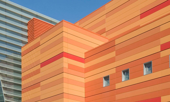
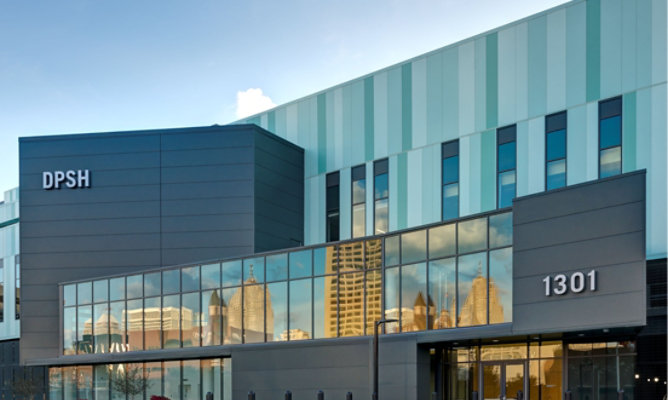
Consumers are becoming more mindful with their purchases, searching not just for convenience, but also control. They look for those same qualities in the design of the environments around them.
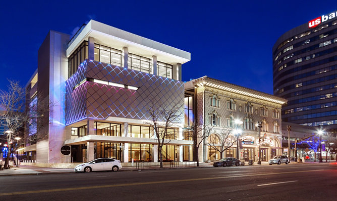
In our next post we’ll discuss the color, material and texture implications of the Hit Pause trend as they relate to building and architectural design. As part of this series, we’ll take a look at other trends Valspar has identified that will influence the look and design of buildings to come. We'll also share with you some case studies where you can see these trends come to life.
Editor's Note: Valspar was acquired by The Sherwin-Williams Company on June 1, 2017.
Hit Pause Color Trend
Duration - 1:9
Related Color Trend Articles
Architectural Color Trends
Take a look at other color trend articles.
Go to Media Center