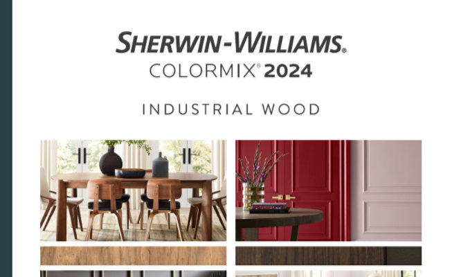
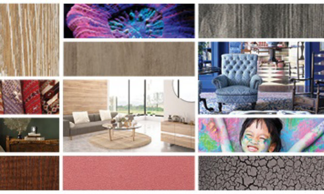
The Power of Color
Sherwin-Williams harnesses a collaborative approach to color, which allows the company to align on complementary architectural and wood finishes.
Color experts, Lauren West and Sue Wadden discuss the importance of integrating color and design expertise to offer complete solutions to manufacturers of industrial wood products.
Lauren West is the Director of Global Color and Design for the Sherwin-Williams Industrial Wood Division. She researches color and lifestyle trends, drawing upon her 28 years of experience, to provide cutting-edge expert color recommendations for the manufacturers of wood products.
Sue Wadden is the Director of Color and Design for the Sherwin-Williams Paint Stores Group. As the voice of color for Sherwin-Williams, she is responsible for the company’s overall philosophy of color leadership, overseeing world color trend forecasting, and leading collaboration between divisions to ensure a unified approach to color that addresses our customers’ needs across applications.
Why should a wood product manufacturer pay attention to paint color trends?
Lauren: Creating color harmony is the best way to pull all the segments together in one space. Wood product manufacturers are often looking to deliver complete solutions for their customers. One of the great things about working with Sherwin-Williams is that a manufacturer can offer a customer kitchen cabinets or flooring finished with our coatings, and they can also work with us to identify the right wall colors to complement those finishes– sending their customers to their local Sherwin-Williams store to complete the look.
Sue: When manufacturers pay attention to color trends, they gain continuity within their product offering. The colors we showcase on the architectural paint side can help drive consumer demand for wood coating applications, like cabinetry and furniture. It’s important to meld the work on the architectural and wood finish sides, whether it’s aligning architectural coatings with flooring products or helping kitchen cabinet and furniture designers with palette swatches. The color selection process for both wood OEMs and homeowners is complex, but when product lines are designed to complement one another, they build confidence and increase customer satisfaction. Consumers want to know that these products will coordinate and work together in a space.
Lauren: At the Global Color & Design Center (GCDC), wood stylists take the information we glean from our architectural sales and use that knowledge to support our industrial wood customers. The most powerful way to open a conversation about color is to show them the top 50 architectural colors from our 4,500+ retail stores. We use sales numbers to follow what is going on at the retail level and apply that to color work and assessments across all wood segments, considering all of the wood products from the front door to the back deck.

A manufacturer can offer a customer kitchen cabinets or flooring finished with our coatings, and they can also work with us to identify the right wall colors to complement those finishes– sending their customers to their local Sherwin-Williams store to complete the look.
What architectural and wood colors are you and your teams seeing trending?
Sue: There are trends we are seeing on the architectural side for kitchens. Homeowners are embracing the mismatched “tuxedo” look, where they opt for natural wood on wall cabinets and mix them with painted off-white base cabinets. It’s important to note that not everything has to match to create a cohesive kitchen. You can pair bright white cabinets with a blue-painted island to create a focal point. Or you can pair deep, green-painted cabinets with bright white walls.
Lauren: We know that white paint is important for kitchen and bath, as well as white stains for furniture and floorings. Brown stains will also never downtrend in the Americas; they will always be important, but they evolve. For example, we are currently moving away from browns with red, orange and yellow undertones into rich, deep blends of chocolate and ebony that feel modern, yet nostalgic.
What tools and resources can help wood manufacturers consider color from a holistic point of view?
Lauren: Our new Industrial Wood Color Visualizer tool is an excellent place to start when it comes to helping your customers envision color holistically. Sherwin-Williams offers a unique color visualizer for manufacturers and end-consumers that allows them to envision what architectural paint and wood colors will look like together in kitchens and on home exteriors. When they can envision what their home will look like with your products on or in it, they can start to consider what the walls beside those products look like and how paint colors interact with the finishes. It’s a great way to allow them to see the full picture.
How does Industrial Wood and The Americas Group work together to align its yearly forecasts for wood finishes and architectural paint colors?
Sue: The trend cycles for architectural paint and wood finishes are different, but they run parallel to each other and influence one another. Each year, Sherwin-Williams sales and color experts get together to determine the color direction for the upcoming year. I will launch the color collection on the architectural side and then work with Lauren on the wood side.
Lauren: We are fully immersed in Sue’s design thinking process and use that as inspiration as we integrate the color, feeling and message for our Industrial Wood segments. We take product development, sales, social, cultural and economic trends into account when researching and analyzing color. Then, we come together with this information to have a stronger, more collective conversation about color. The result is a cohesive trends forecast that spans industries – pulled together by a consortium of global color experts from all across Sherwin-Williams business segments.
It’s important to note that not everything has to match to create a cohesive kitchen. You can pair bright white cabinets with a blue-painted island to create a focal point. Or you can pair deep, green-painted cabinets with bright white walls.
What can wood product manufacturers do to learn more about color?
Lauren: Manufacturers can partner with our color teams. We directly interact with interior designers, merchandisers and others in design-based professions who work in the product development process. We understand that people can’t know what they don’t know, so our team at the GCDC makes it a priority to offer the resources to help customers understand the power of color.
To learn more about the services we offer, contact your local Sherwin-Williams representative or visit our GCDC page.
This article and more are featured in our Q3 issue of ProFinisher
ProFinisher highlights Sherwin-Williams product and innovation updates, customer success stories, tips to help your business operate more productively, and an offering of equipment and supplies designed to enhance and improve your finishing processes.
Read MoreNews & Media
Featured Media
Learn about industrial wood industry updates, view customer success stories, get product details, watch helpful videos and more!
Go to Media Center

Case Study
May 21, 2024
Castleberry Case Study
Castleberry Shutters Boosts Productivity With SHER-WOOD® EA Hydroplus™ Waterborne Topcoat
Article
March 8, 2024
Four Challenges for Wood Coatings Professionals
Industrial wood finishers face some challenges in today’s market. Find out how to overcome them with expert assistance from the right wood coatings partner